Open eyes
for better care
Role
Brand Narrative I Brand Design I
User Interface I Short-Copy
Brand identity for a progressive eye surgery clinic, founded as statement against bureaucracy

Oog op Zuid
Goal
OOZ has launched in Rotterdam's medical eye surgery scene, challenging traditional hospitals by their enterprising approach and ties to the academic hospital. They prioritize patient-centric care, excellence, simplicity, and hospitality – a message to be made clear from the first hello.
Solution
Development of a brand narrative that continuously communicates three core values. The identity serves as navigation for any visual communication.
Result
A creative strategy and distinctive visual identity that secures foundation for campaigns, digital spaces, indoor, and print. It has gained positive feedback from patients and general practitioners, as well as an increase of applications from new employees.
Learn more about the details ›
Brand
narrative
To develop the brand narrative, firstly a positioning session was established with main stakeholers, to explore what exactly defines OOZ and how they stands out in the market. It provided valuable insights, forming the foundation for the brand.

Identity
and design
The brand identity has to reflect the defined core values of Simplicity, Care, and Open. Doing this by a clear and communicating visual design that at the same time sets OOZ apart from traditional hospital communication.

Visual
language
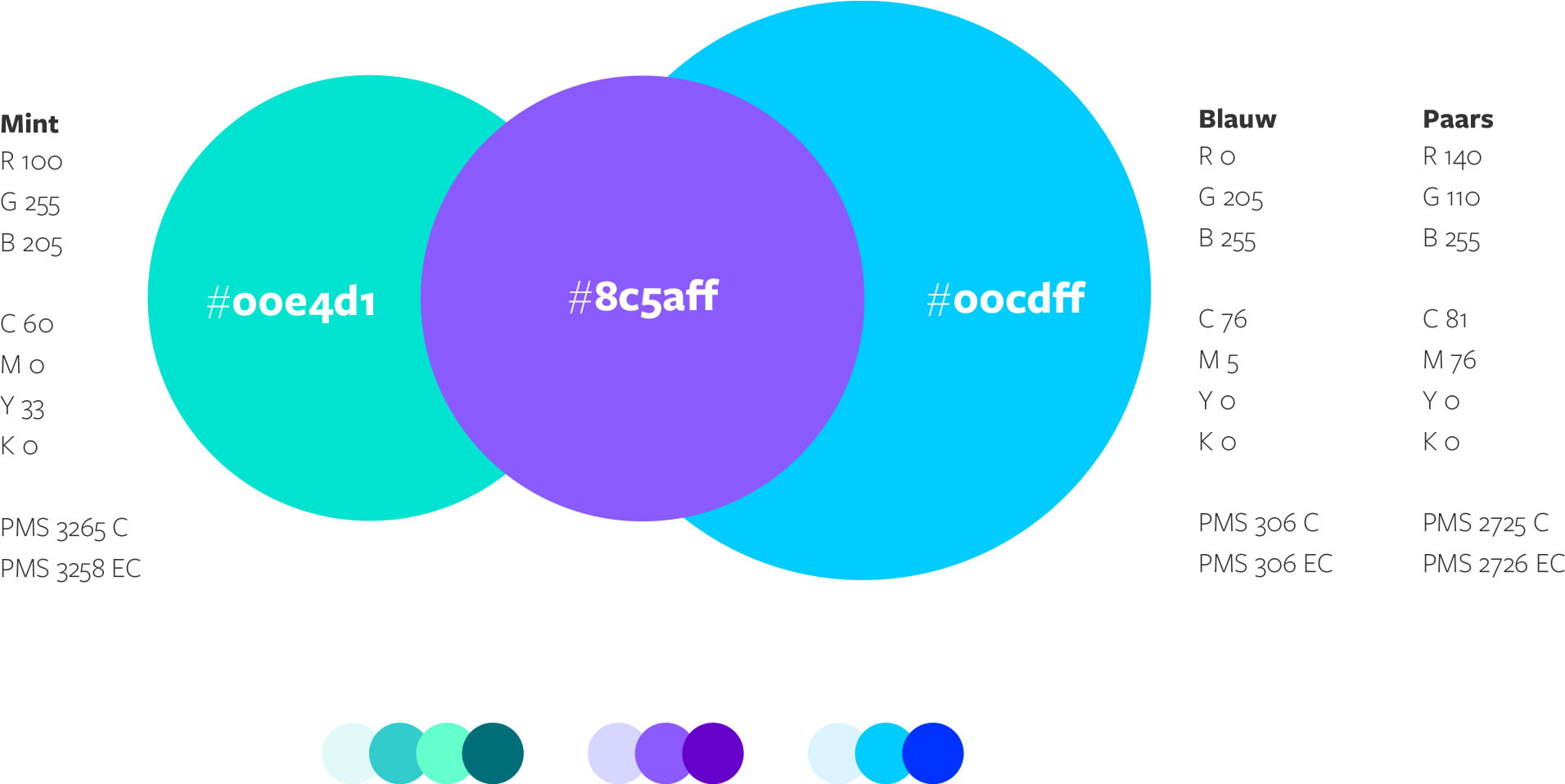
The branding foundation, built on core values and three primary colors, led to the expanding of a visual language that includes font and tone of voice, digital assets for the website and portal, and components for various visual communication.
Website and
digital portal
The first key touchpoint for introducing the brand to patients, visitors, and medical professionals. The web design reflects the brand values, featuring a functional structure, tailored elements for the target audience, and take-away summaries on information pages.


Launch
campaign
For the launch campaign in Rotterdam's (and area) public life, the concept was to allow the brand's values to stand out on their own. This is done by a bold tone for copywriting of the headers in combination with a minimal design.


Indoor
communication
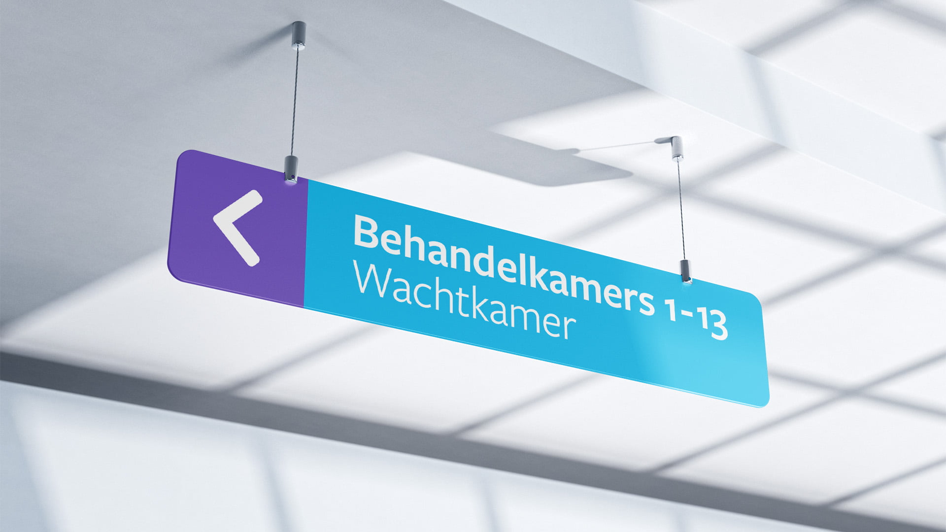
Indoor, the clinic’s signage provides clear navigation for patients and visitors, while guiding medical staff along compliance-required routes. It shows adaption of the visual language to multiple means.


Workwear
The hygienic workwear is a visible part for patients, visitors, as well as a daily asset for employees. They are balanced between medically professional, comfortable, on-brand, and modern.

Print
items
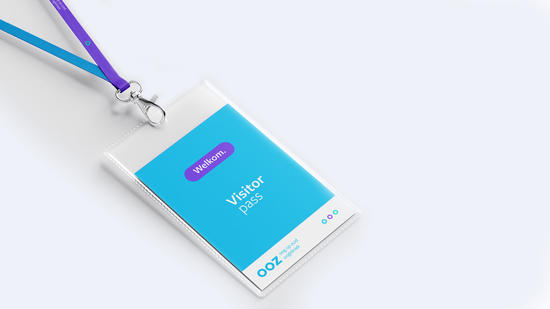
The brand basis ensures a consistent visual direction across all types of items. It checks for: 1) Simplifying information and processes, 2) Assuring capable patient care, 3) Guarantee of a welcoming tone.


Branded
interior
The final stage of the brand launch focused on interior art direction, including the utilization of spaces, waiting room seating, and on-brand visual communication.
Contact
bonjour@sachakoch.com
linkedin.com/sachakoch
The Hague
Brand x Design
clear storytelling
connecting design
© Sacha Koch 2025
Think with the head,
act with the heart


